

Support high immigration? Explain these shocking charts (labor force participation rates by age, gender, ethnicity)
Here's a challenge for supporters and enablers of massive or illegal immigration: explain these shocking charts.
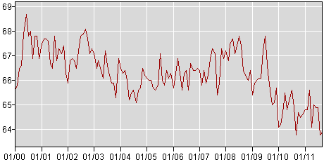
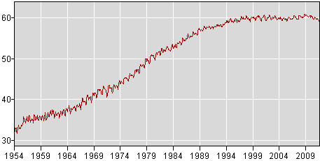
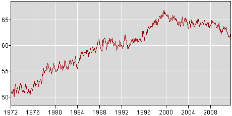
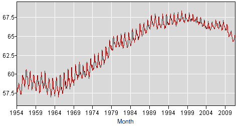
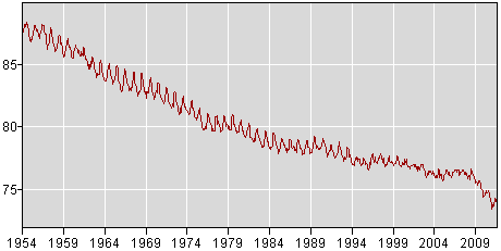
The charts (from the Department of Labor's BLS, [1]) show the labor force participation rate for various ethnicities, genders, and ages, with steady drops for most groups and especially for men, blacks, and youths. Note that the rates for Asians and white women has held mostly steady over the past decade.
There are no doubt a large number of reasons for these statistics: social factors, NAFTA, the "knowledge economy" taking over from a manufacturing economy, the rise of China, and so on. However, my assumption is that at least a good part of the declines are due to massive immigration. I'm also assuming that most of those immigrating here (legal or illegal) aren't competing with white women and Asians, helping to explain why their statistics haven't fallen like other groups. I'm also assuming that massive illegal immigration by low-skilled men explains much of the decline in the youth rates: jobs they could take at fast food restaurants and the like have been filled by those low-skilled illegal aliens.
But, those are just my assumptions. I want to hear from those who support massive immigration:
1. Do you admit that one or more of these declines are due to the immigration policy that you support? If not, list the other issues at play that could explain away all those declines. If so, how much? A little, a good bit, a lot? If you only admit that a limited set of the declines (such as among youth) involve immigration, which ones? Provide studies backing up your claims.
2. What are the costs of having so many people out of the labor market? For instance, what are all the costs of having somewhere around 75% of black youth not in the labor market?
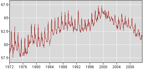
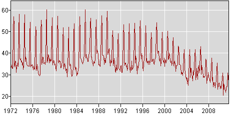
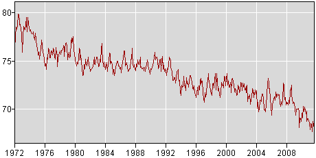
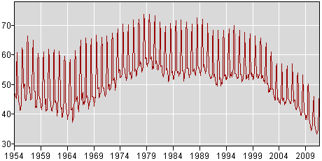
Here are the charts:
Asians (all):
White women over 20:
Black women over 20 years old:
Whites (all):
Blacks (all):
Blacks 16 to 19 years old:
Black men over 20 years old:
Whites 16 to 19 years old:
White men over 20 years old:
-------------------------
[1] To see those statistics yourself:
1. Go to http://www.bls.gov/webapps/legacy/cpsatab2.htm
2. Click all of the "Participation rate" checkboxes and press the "Retrieve data" button
3. On the next screen, click "include graphs" and choose the widest year range, then press "Go".