

NYT's immigration map by group and by time shows: Mexican immigration like no other
Posted Wed, Mar 11, 2009 at 9:43 am
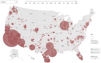
The New York Times has an interactive map showing where those from various countries settled in the U.S. and showing their proportion in relation to the then-current population (link). You can move the slider at the top to watch the migration pattern change over time. And, what it shows is that immigration from Mexico is like none other in our history. While there was a past large flow from European countries mostly into the Northeast and upper Midwest, it was nothing like this: